
.png)
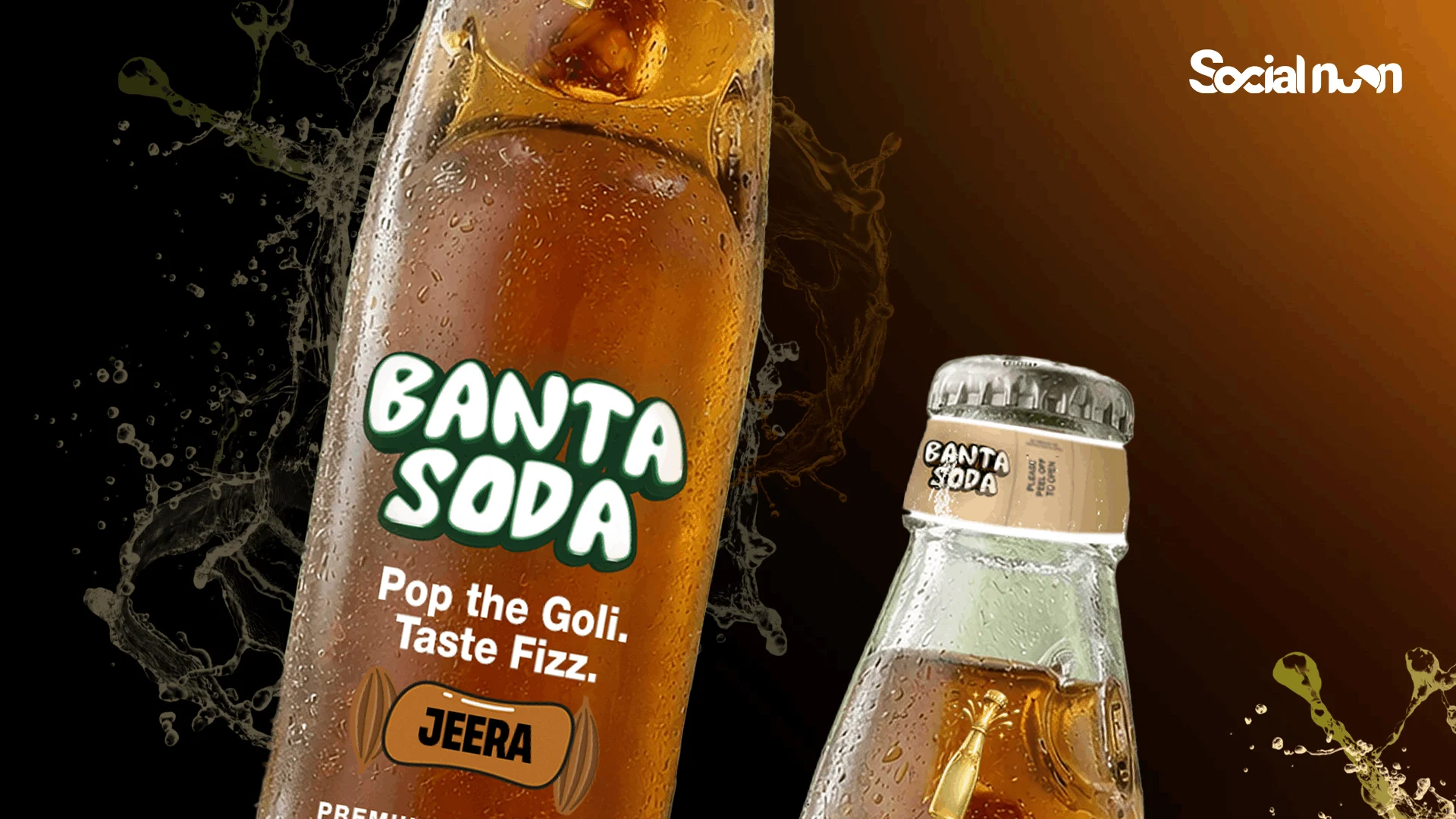
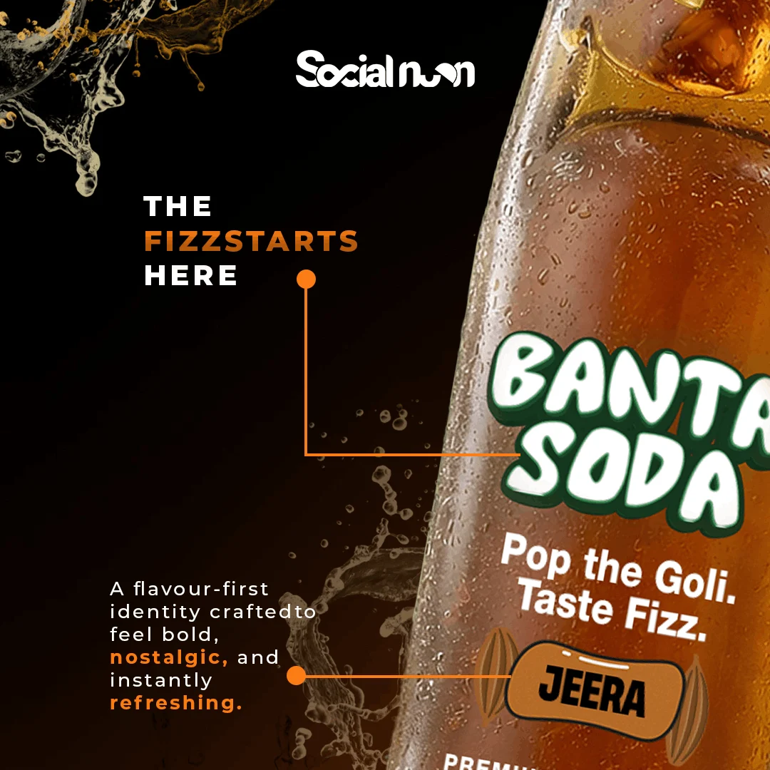
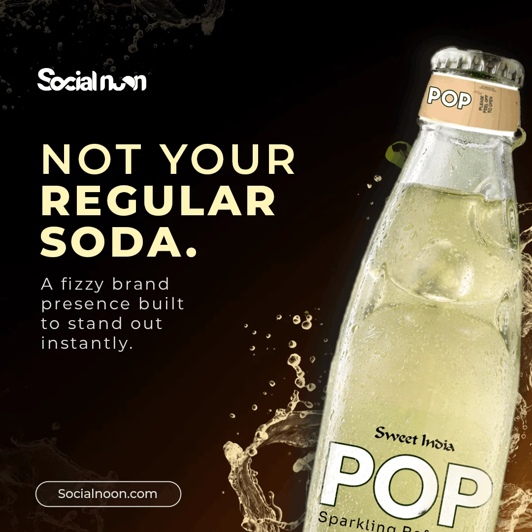
Label Design
Sweet India PTY LTD
Australia
March 25, 2026
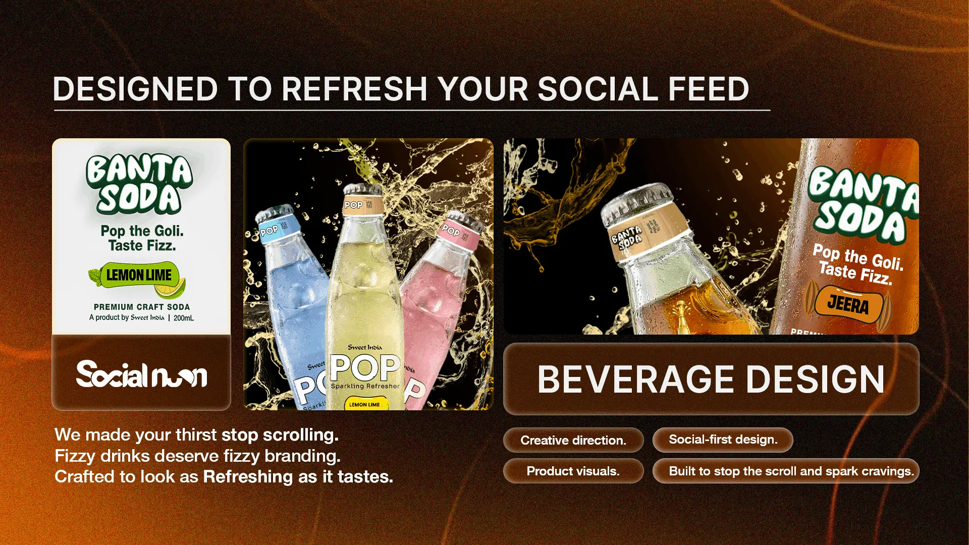
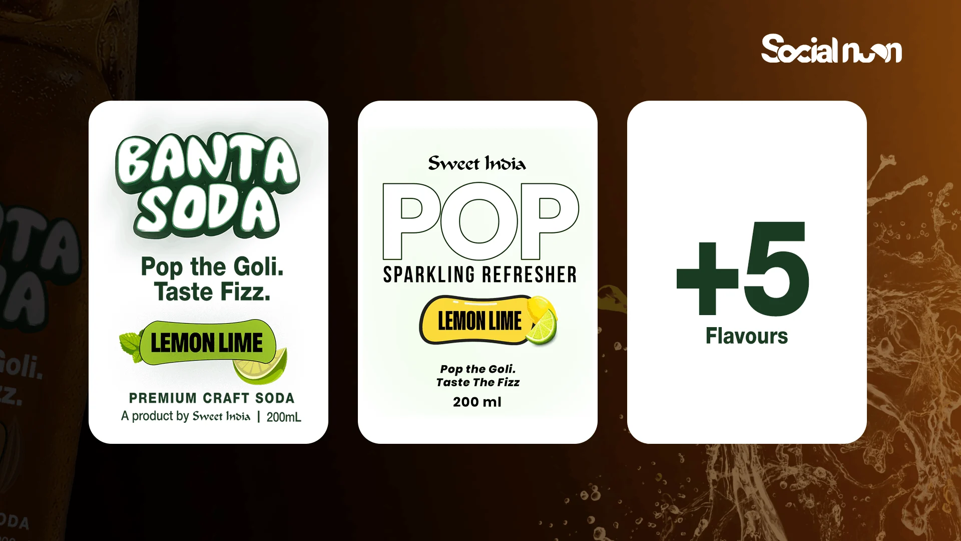
Sweet India expanded its product ecosystem with POP Soda — a vibrant beverage concept designed to bring a fresh, youthful, and visually exciting identity into the traditional food brand portfolio.
Social Noon partnered with Sweet India to conceptualize and design the packaging identity for POP Soda, creating a label system that balanced modern beverage aesthetics with playful brand energy and strong shelf visibility.
The beverage market is highly competitive and heavily driven by:
For POP Soda, the challenge was creating packaging that could:
The label needed to feel: bold, refreshing, playful, and instantly recognizable. At the same time, the identity had to work across multiple flavors while maintaining a cohesive visual system.
We approached POP Soda as: a youth-driven lifestyle beverage brand rather than just a packaged drink.
The strategy focused on:
The objective was to create packaging that immediately communicated: freshness, excitement, and fun.
We intentionally designed the identity to feel:
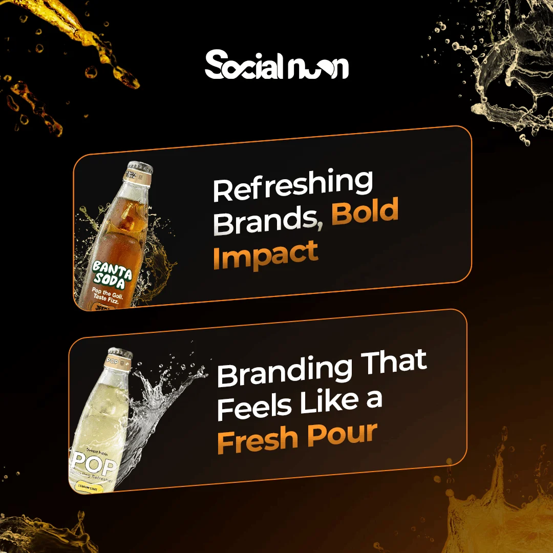
We conceptualized and designed the complete POP Soda label identity system with a focus on creating a visually impactful and scalable packaging experience. The design language combined flavor-based color coding, modern typography systems, bold label compositions, and contemporary beverage aesthetics to give each variant its own distinct personality while maintaining strong overall brand consistency. Every element was carefully optimized for shelf visibility, quick consumer recognition, retail readability, and strong product recall — resulting in a packaging identity that feels energetic, refreshing, and culturally modern.
The primary goal was to create a visually distinctive packaging identity that could establish POP Soda as a recognizable and modern beverage brand within a highly competitive category.
The project aimed to:
%20(1).png)